toronto zoo
VISUAL IDENTITY
PROJECT TYPE
ACADEMIC 2018
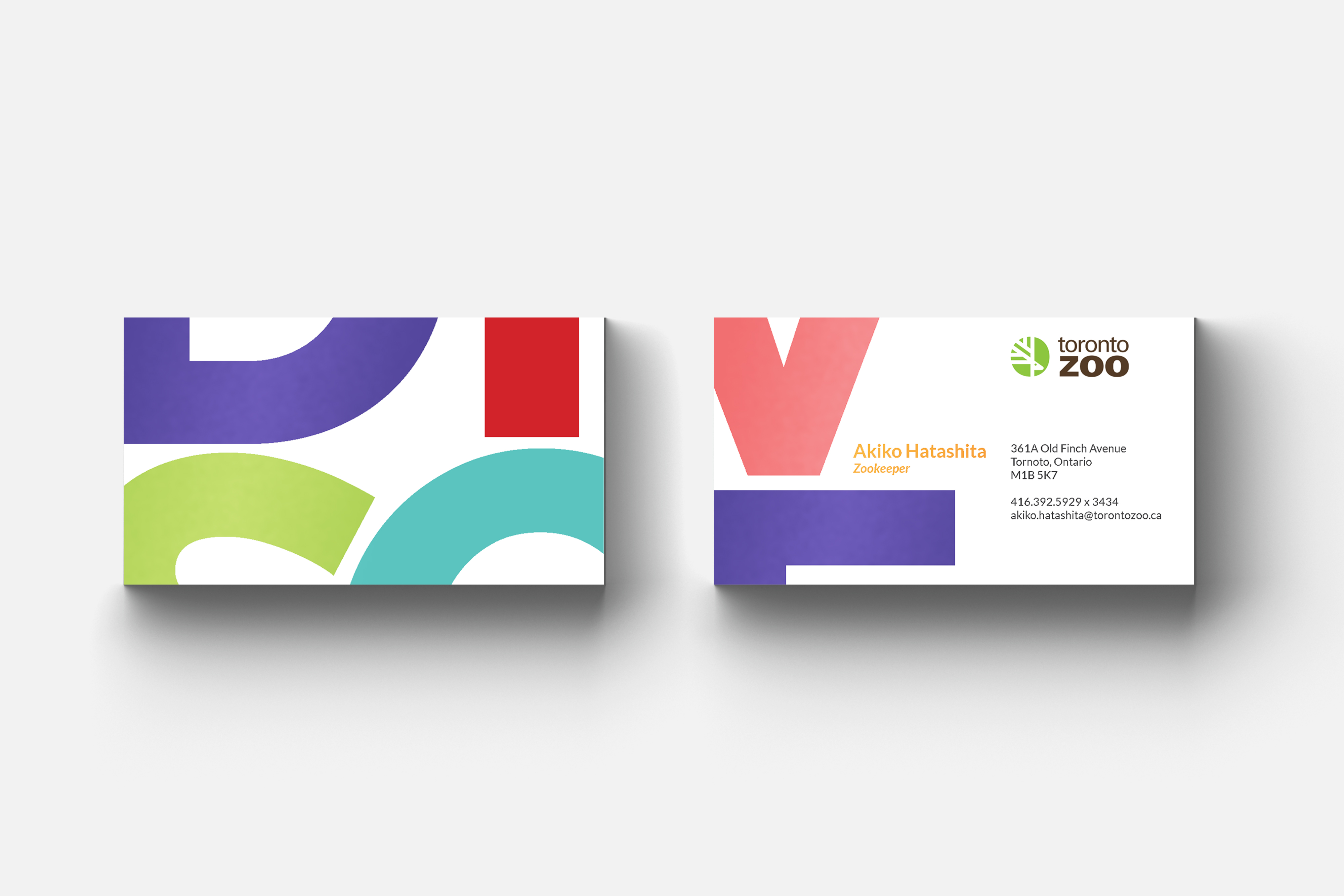
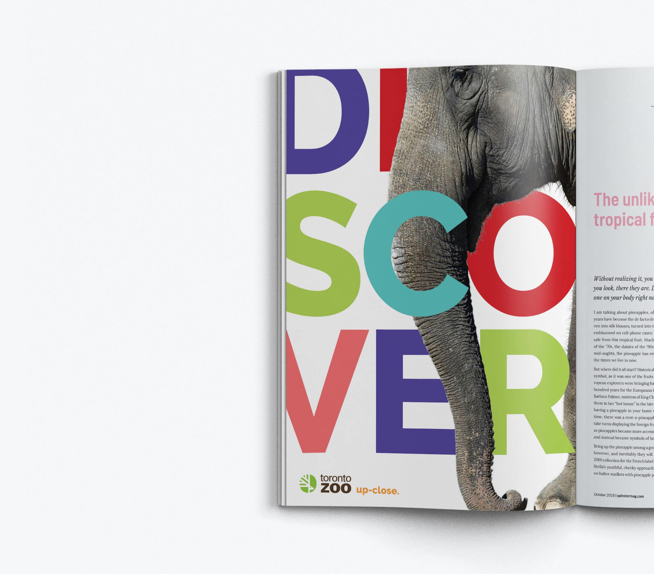
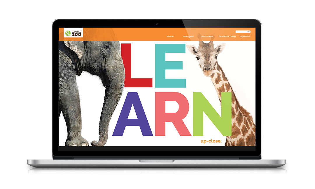
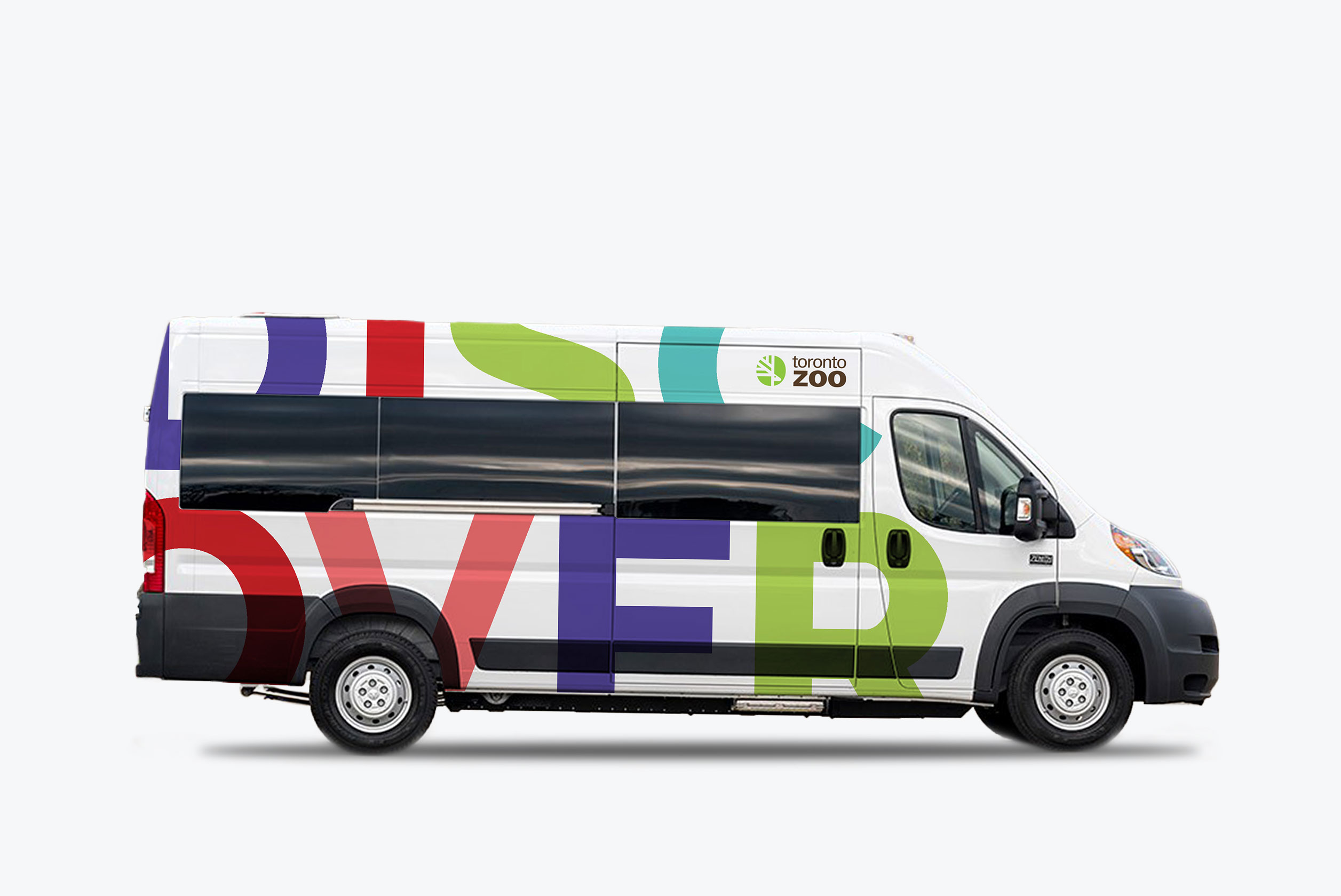
This reimagined visual identity uses typographic design to portray the fun and educational characteristics of the Toronto Zoo. The goal is to develop a brand that appeals to both adults and children. In order to convey the idea that visitors can experience the animals up-close, the display font is always used in uppercase, set in separate lines, and running slightly off the page. Images of animals are in isolation and emerges into the design from the edges of a page. Colours chosen for this identity stems from the zoo's original brand colours, while adding a few other hues for a vibrant pop.

 by Judy Yen
  with
with 